HealingHand Tech
UX Design Internship
Maintaining stroke patient progress and compliance

Duration
Role
8 months
Results
UX Researcher
UX Designer
Usability Tester
Improved user validation rate (90%), improved understanding of wearable device usage, and envisioned improved patient compliance rate. Completed MVP Web App with 5 usability testing.
Tools
Figma
Adobe
Miro
ClickUp
Overview
HealingHand Tech is a company that specializes in helping stroke patients regain control of upper limbs through home-based wearable devices. The UX team is given the task of creating a desktop app that streamlines the program-building process, where occupational therapists assign and monitor exercise games to patients with the use of wearable device.
Through in-depth research, we found that occupational therapists face the most challenge in maintaining stroke patient compliance and progress instead of assigning programs. Therefore, we reframed the problem and designed the Patient page such that it reflects patient's real-time progress with the wearable usage data and enables a streamlined exercise program assignment and monitoring process.
My task includes conducting a part of the interviews, synthesizing data into actionable insights, and wireframing the structure of Patient page, and designing the Overview, Self Reports, and a part of Exercise program page with assistance of team members.


Research
Our team narrowed the scope to core feature first --- program building for MVP. We identified risks and clarity of the problem and concluded that we needed research, include clinical treatments of stroke patients, in-depth understanding of the problem from the user side, and how product fits into the treatment process. We decided to do in-depth interviews with questionnaires as pre-questions. I helped construct the interview objective and script and led 6 interviews.
Identifying problem risk and clarity

2 Rounds Research

We learned about difficulties of stroke exercise programs, including low or unknown patient compliance, which more than half participants brought up and 1/3 emphasized. Along with other team members, I was surprised about the finding because I thought assigning appropriate and helpful program was the most difficult part, but keeping track is the most difficult and demotivating for both patients and therapists.
Synthesized Themes

Actionable Insights

Occupational therapists need to be able to effectively monitor and engage with the patients during and after program assignment to do job better, and creating/assigning the programs is not the core pain point.
Therefore...
Problem Reframing
How might we enhance patient compliance and enable real-time progress-monitoring to motivate both patients and therapists?
Ideation
Design Concepts & Features

We came up with three main design concepts and ideated features accordingly and major features that we plan to implement on the Patient’s page.
For Exercise Program where therapists can build programs for the patient, we encountered conflicted opinions from the company CEO and the users, where the former wants us to focus on the game aspect, aligning with the business objective, and the latter on the treatment aspect. Therefore, we decided to iterate two assignment versions: To address this, we incorporated both perspectives into separate A/B versions of the program-building flows: one more aligned with the OT cognitive maps and the other with business needs.
Patient Page should:
Design
Features Wireframing
As a team, we outlined a UX content strategy that integrated all the information needed to go in the Patient page. Because of the density of information, we decided on a major tabs section for the five features: Overview, Goals, Exercise Program, Self reports, and Check-in, and a Messages section such that we can maintain versatility and consistency. The two sections also make sure the page is patient-centric and core to the therapist workflow in helping patients in exercise programs.

In the Patient page, we outlined five features presented in tabs:
-
Overview for one patient's basic information, progress, and compliance such that the therapist gains a comprehensive understanding of the patient's condition at a glance;
-
Goals for therapists to set longterm personalized goals for the patient;
-
Exercise program for home exercise program building;
-
Self-reports for therapists to see patients's reports of any pain or fatigue in the programs;
-
Check-in for therapists to send weekly feedback and words of encouragement.
Design System
To ensure we accommodate users of various abilities, we utilized Google's Materials Design for colors, grid, and space and designed for dark and light mode. We crafted a universal set of buttons and icons to maintain a sense of consistency.


High-fidelity
Patient Overview

Patient Information
Present basic patient and treatment information that therapists need to assess conditions and assign programs.
Weekly Compliance
Shows if patients perform the exercise on a daily and weekly basis and the percentage to which they successfully perform motions
AROM Progress
Visualize Active Range of Motion of patients in 6 parts of upper limb by presenting initial and current progress in colored hexagons
Messages
Independent message chat-box on right to enable real-time message exchange between therapist and patient
Check-in
Alerts on top of Patient Page directs therapists to “Send check-in” and take them to Check-in tab.
After discussing with the ex-occupational therapist team member, we came up with two column design to encourage Weekly check in, providing Patient’s comment, self-reported mood, and compliance for the week for the therapist to provide a check-in notes. The right secondary column provides reference to past history and pre-written phrases.

Self Report

With the team I visualized the four patient self-reported metrics that occupational therapists identified as important progress indicators:
-
Pain: area chart with movements labeled with a Break Triggering Moment level indicator
-
Fatigue: bar charts presented in battery level
-
Mood: icon indicators with five levels by hovering, with Very dissatisfied and dissatisfied paired with Break Triggering Moment (BTM) that therapists need to pay extra attention to
-
Goals: comparative bar chats with different goals and their reported perceived difficulty level
*hover to see each line/bar/box represented information
Exercise Programs
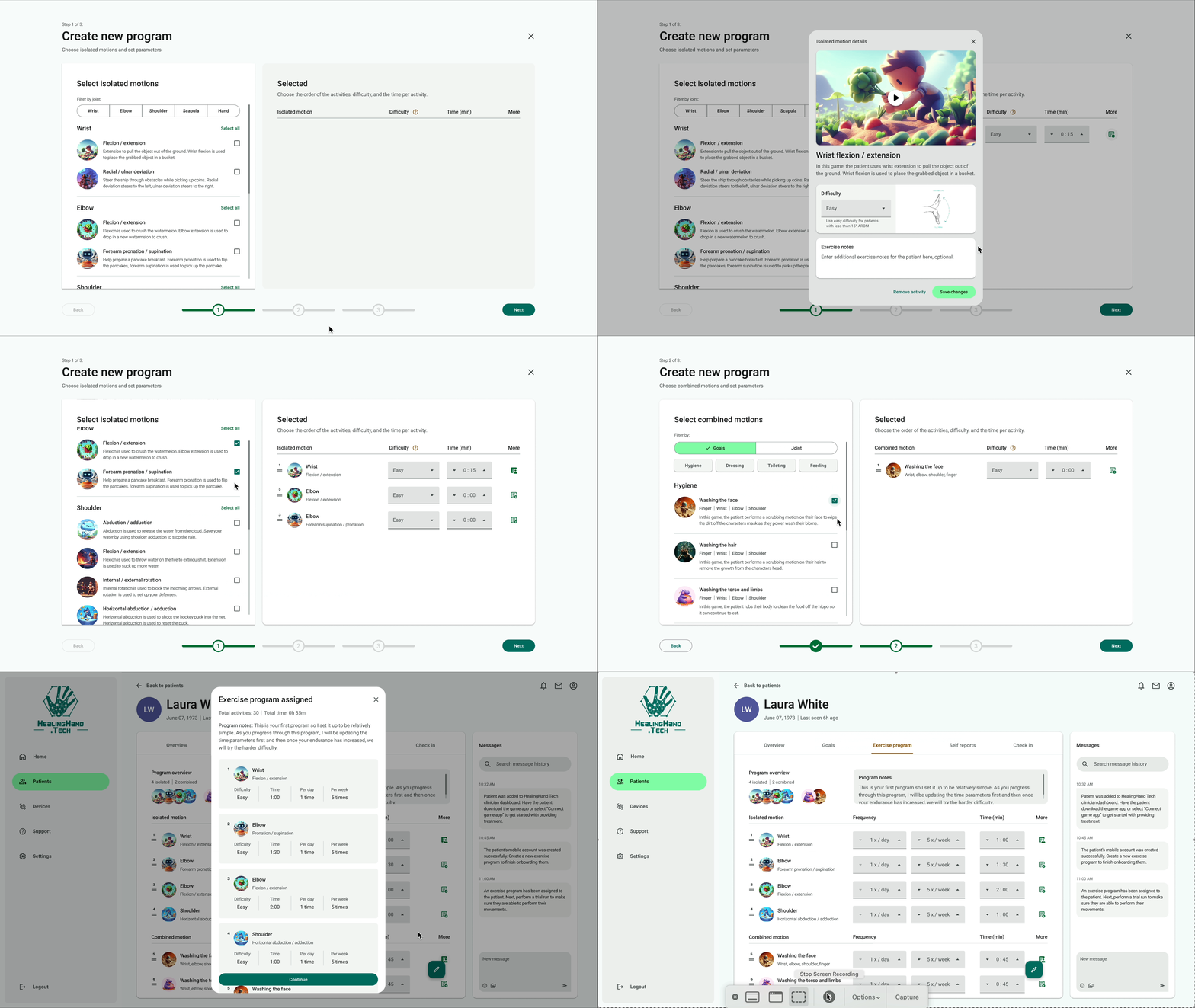
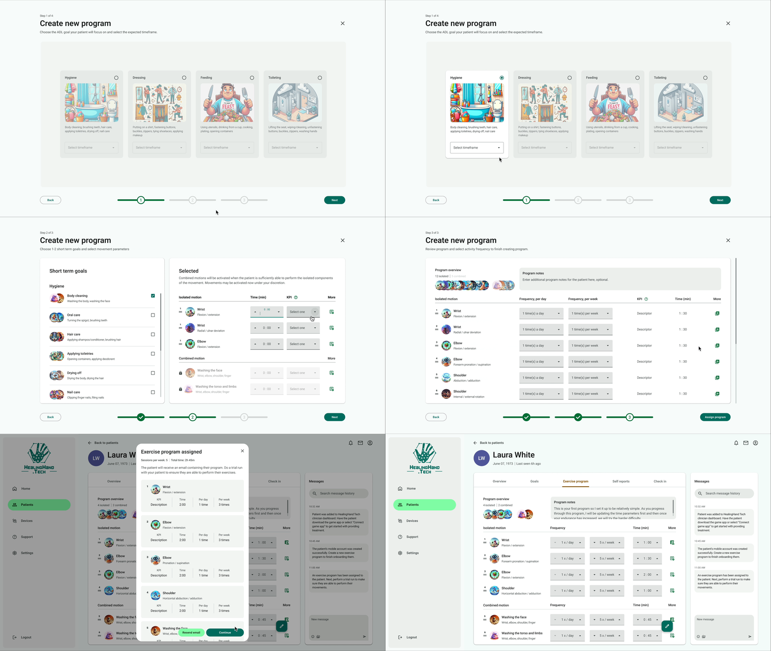
From user research, we found that there is a conventional mode of therapist work flow - specifying a motion that the therapist wants the patients to work on and expand into combined motion and a potential longterm goal, which matches with the therapist's cognitive model. At the same time, therapists have also indicated that a more goal-oriented approach might benefit the assignment process and help with goal-tracking.
Therefore, we designed two program builder flows: A for motion oriented, and B for goal-oriented for the A/B MVP testing to gage user's reactions.

Program Builder A- motion oriented

-
Align with occupational therapists’ cognitive model to build the treatment plan.
-
A conventional way to create exercise plans from isolated motions to combined motions

Program Builder B- goal oriented

-
A more innovative way to build treatment plans
-
Pair with goal-oriented exercise games we designed by starting with goals then breaking down into combined motions and isolated motions
-
Combined and isolated motions are set in the system with games
MVP Usability Testing
Test Construction
As a team we wrote the test guide with the following research goals:
-
Evaluate the overall usability of task flows
-
Observe target user (i.e. occupational therapist) behavior when interacting and collect insights on user flow experience
-
Gather feedback on user interface, visual design, and data visualization charts
-
Determine the overall level of content comprehension and impressions
-
Compare and contrast A/B program building and evaluate their level of cognitive apprehension and consistency with workflow
With these objectives in mind, we conducted moderated usability testings with two sections: guided Figma prototype click-through test divided into A and B version, and card sorting for alert contents.
Testing and Iteration
After synthesizing the insights from the testings, we incorporated a few iterations.
Since we found positive reviews on some parts of A and B flows, such as A's overall easiness on navigation and B's visualization of the Activities of Daily Living (ADLs), we combined them and redesig
I participated in clarifying some data visualization by adding additional visual cues on Self Report and AROM chart on Overview, and enlarging buttons and tabs.
Results
We conducted a total of 5 usability testing and received the following positive feedback:
“Generally easy to follow and accessible. “
“Like the colors and styles and how accessible they are”
“Great solutions on maintaining patient compliance and progress monitoring, can see it in effect in motivating therapists.”
In the MVP testing, we were able to receive a 90% average user validation throughout all tasks. In the onboarding, we also saw an improved understanding of wearable device usage (60% -> 75%). We envision an improved patient compliance rate in the future.
Takeaways
I learned a series of HOW’s:
-
how to build a desktop platform with many needs and high stakes
-
how to narrow scope
-
how to identify business needs and user needs and balance/trade off
-
how to prioritize tasks according to risk and clarity and core feature.
Also learned how to collaborate with a small team of talents, communicate with designers, design leads, other teams such as Game Design and R&D, and higher ups.
Overall, learning that my design made the job of OTs more streamlined and transformed the traditional program-building to one that is accessible and appeasing brings me a sense of fulfillment.
