MyChart
UX/UI Redesign
Improving COVID-19 Information Transparency

Problem
Pandemic-related anxieties have been surging amongst our UCSD student peers, especially concerning recent situations. While a large number of students are getting infected/exposed on and off campus, there is a lack of COVID-19 information transparency which results in delayed medical attention, delayed testing, wider spread of the virus, which all contribute to growing feelings of unease, fear, and worries.
The UCSD Health sponsored app, MyChart, thus serves an important role during this time. However, its current design does not provide direct and immediate information and service about COVID-19.
Therefore, we are motivated to redesign the MyChart app in order to improve COVID-19 information transparency and reduce our peers’ stresses during this difficult time.
See prototype

MyChart before redesign
Research
To narrow down our research focus, we came up with two research questions:
-
How accessible are COVID-19 related information on MyChart?
-
To what extent does MyChart help people reduce anxieties towards COVID-19?
With these directions in mind, we created surveys using Qualtrics and gathered 64 feedbacks from UCSD students. Amongst the respondents, we selected 4 participants who consented to further studies and conducted direct observations.
After extensive data collection and analysis, we gathered a lot of interesting findings amongst which we concluded the three major insights:
Insights 1.
Difficult to find COVID-19 info (policies, announcements, what-to-dos)
Insights 2.
COVID-19 related services (schedule appointments, view records) all over the place
Insights 3.
Don't find MyChart sufficiently helpful in reducing anxieties towards COVID-19
"There's too much information on the page...like, it does not bring me peace." —— Participant
Inspired by these insights, we came up with three major design approaches:
Approach 1.
Provide quick and upfront access to COVID-19 info
Approach 2.
Merge all COVID-19 related things together in one place
Approach 3.
Redesign the flow and feel of the app to make users feel welcomed and reassured
Design Process
UX Flowchart
After establishing our general approaches, we organized the most important features on the main page: Appointment, COVID-19, Reminders, and Help, with our main focus on the COVID-19 feature due to time constraints.
We then created the UX flow of the redesign after multiple iterations.

Final Overall UX Flowchart

Final COVID-19 UX Flowchart
UI Sketches
To get design ideas quickly, we sketched on papers and iPad according to our UX flow with the the research insight and major approaches in mind. To ensure we don't get constrained by a set design thinking, our sketches came with varying versions.

Sketch version 1
Low Fidelity Prototype & AB User Testing
After discussions, we created two low-fidelity prototype versions per the basic design of the two sketches. However, we added some extensions of details, particularly in the Select Date Page and Test Result document Page. To figure out the most smooth UX flow in our focus feature, COVID-19, we designed two functionally different pages for in the two versions.
In the Lo-Fi AB User Testing, we have the users participate in a total of 5 tasks plus a Follow-up Questions section for both flows so that users can compare and contrast between the two. We gathered the following major findings:
-
Participants generally prefer the Main Page for Flow 2 because of the presentation of QR code.
-
Participants all prefer the “COVID-19” page for Flow 1 with the boxes- format buttons.
-
Participants expressed that scheduling COVID-19 test and vaccine appointments should also be accessible from the “Appointment” tab on the main page.
-
Participants expressed that any sort of help should also be accessible from the “Help” tab on the main page.
In short, we believe that user testing participants equally like the two flows for different features, and there is no strong preference over one. Thus, we will be combining features from both flows and create one flow that incorporates benefits of both and add the desired access to the Appointment and Help tabs.
Flow 1
+
Flow 2
=
Final Lo-Fi
Prototype

Lo-Fi Main Page
See Final Low-Fidelity Prototype
High Fidelity Prototype & AB User Testing
After finalizing Low-fidelity prototype, we turned it into a High-Fidelity prototype. As we were doing it, we made some changes such as redesigning the Schedule COVID-19 Vaccine and COVID-19 Test flow, adding FAQs at the bottom of Schedule COVID-19 test page. We decided to follow the original color scheme to make users feel familiar with the product from the way before.
To conduct the final round of user testing, we created Alternative Versions for the screens that we still have doubts on: Schedule COVID-19 Test and Schedule COVID-19 Vaccine screens. The AB testing helped us sort out the final flow of Hi-Fi prototype.
One particular participant's request got us thinking:
"What if I only want to find an available testing site immediately and I don't care about the test type?" —— Participant
Considering the perspective of an anxious user who might have such request, we found that the current Schedule design is not useful since it requires the users to click the back arrow multiple times to restart the process.
Therefore, we came up with new Schedule COVID-19 Test and Vaccine screens to solve this problem, which is presented in the Solution section.
Solution
After a iterative design process and 3 rounds of user testings, we propose a final solution that provides immediate access to COVID-19 related information on the Main Page, a comprehensive section for COVID-19 related services, and a smooth and friendly UX flow that cater to different users' needs.

Immediate Access to COVID-19 Info
-
The Vaccination Record tab under the User Profile replaces the original QR Code design which was hidden at a corner. It helps users to quickly access a vaccination records in scenarios that require proof
-
The Notification tab contains the newest info, including newest Test Result or school announcements. It helps users to get to the most urgent info through one tab

Comprehensive section for all COVID-19 related services
-
The COVID-19 tab on the Main Page directs users to all COVID-19 related services and information
-
Under Personal COVID-19 info are Test Results, Vaccination Record, Schedule COVID-19 Test and Vaccine catered to the user's personal demands
-
Under Helpful Resources are What-to-do tabs to help users react to different situations


Smooth and friendly UX flow
-
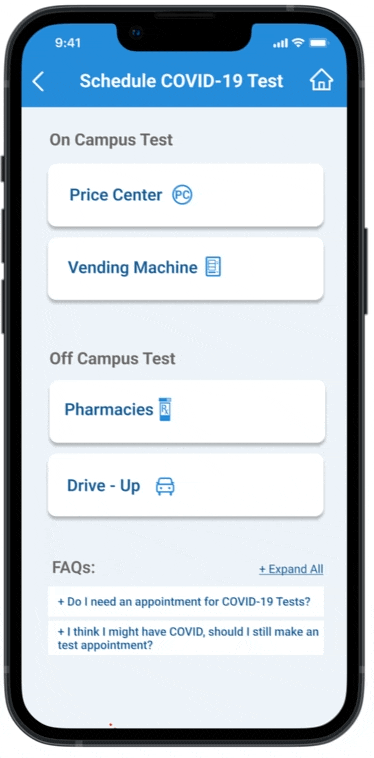
In the Schedule COVID-19 Test and Schedule COVID-19 Vaccine tabs, the users can choose On-campus or Off-campus appointments
-
For instance, when users choose Pharmacy, they can enter zip code/address and select test type(s), or simply enter zip code without selecting a test type
-
Their choices would filter the Location choices, thus catering to users with different preferences
-
Users can then select an appointment time and Schedule Tests all in one screen
To further make MyChart a helpful and friendly application during this difficult time, we also added graphics in the screens to relieve stresses.
As a public health app under the sponsorship of UCSD, we wanted to embrace all people regardless of their health conditions. Therefore, we also made the MyChart screens accessible per the standards of WCAG.
See Final High-Fidelity Prototype

Takeaways
Health service provider applications serve important role in people's lives, especially during the pandemic. It takes time and effort to design services that truly leverage between people's physical demands while taking care of their emotional needs, which hold equal gravity. By redesigning MyChart, I have learned to research and understand the original design perspective and take design approaches with a critical and flexible mindset.
Credit to my teammates:


